the brief
Smart Food Media, a chef lead video production agency came to us for a redesign of their back then, current logo. Smart Food Media’s goal was to clearly communicate that they were a video production company for the food industry. The brand and the website was heavily focused on the lime green colour and they wanted to keep that concept.
what they
wanted to achieve

a bright &
bold logo

simple in form

leave a lasting impression
THE
PROJECT
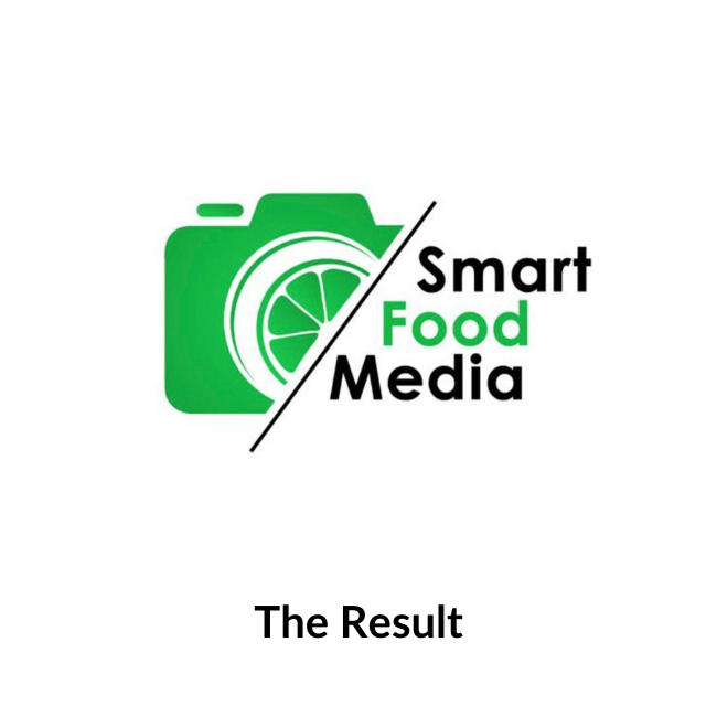
After the initial brief we discovered that Smart Food Media were not 100% sure on what they wanted the logo to look like. They knew they liked the lime green and that they wanted the logo to reflect what the agency did but the design side of things was completely up to us. We decided to incorporate a camera to convey the photography/video element of the brand and of course, food. The lime colour was important so we decided that the food we’d incorporate would be a lime. After providing 4 initial concepts, we discussed with the client which logo concept was best suited. We then took the best parts of 2 logos and made them into one final logo, tweaking it bit by bit until we got something the client was very happy with.
the project

